Yoyo- Fitness App
A UX Case study of creating a digital Fitness solution for
US Colleges athletes.
A UX Case study of creating a digital Fitness solution for
US Colleges athletes.
An app for Sports coaches to assess athletes’ fitness with the YOYO fitness test. All design and research was created from scratch with no pre-existing design solutions in the current market.
The College wanted to promote fitness and reduce injuries of their athletes which was resulting in losing championships due to injuries of their key athletes.
● Plan the entire Layout of the app.
● Design wireframes.
● Style Guide.
● UI documentation.
● Create a functional prototype for MVP 1.
● Visual Design of App.
● Suggest new features for App.
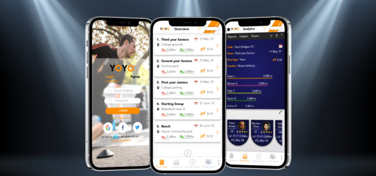
The Yo-Yo test (aka beep or bleep test) was created by Luc Leger of the University of Montreal way back in 1983, as a simple running test designed to test a person’s fitness levels.

I had Researched different fitness solutions and practices to prevent injuries and measure current fitness of students.
This included exploring pilates, yoga, Talked with various sports teams in a college and chose 3 key people from each user group for the User Interview. Created questionnaires, and scheduled meetings.
The primary Users were:
Over 30 years later it’s still popular as it’s a great way to measure a person’s VO2 max levels and highly cost effective.
The YoYoApp has been created to eliminate the need of paper.
The coach can use the app to build a team, conduct a Yo-Yo test, record, view, edit and share results.
The Who we made it for…
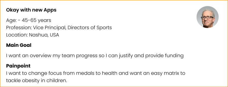
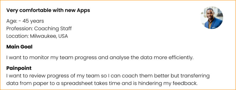
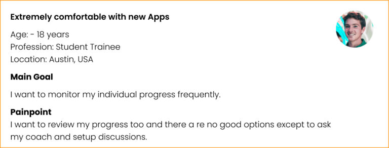
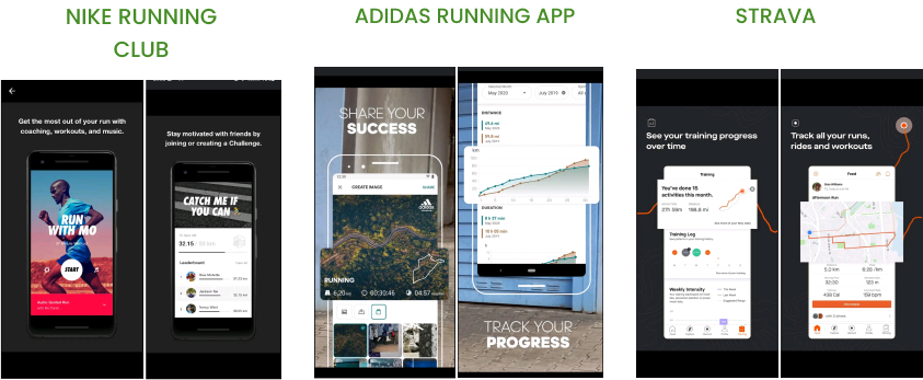
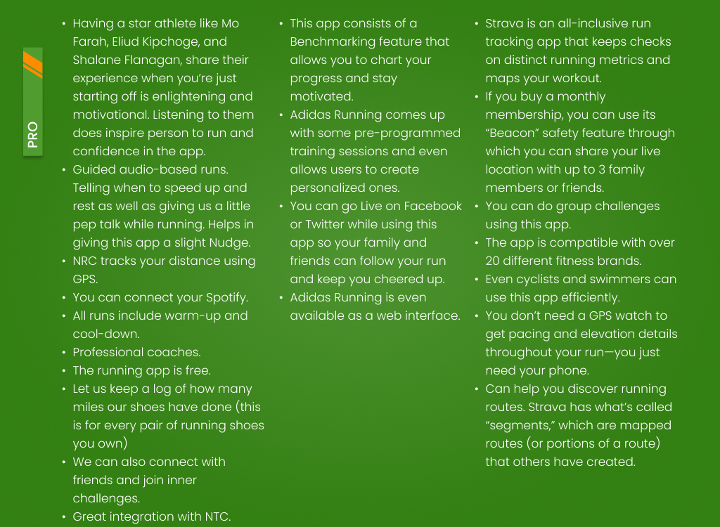
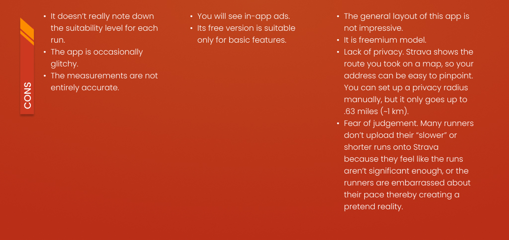
As we had no direct competitor. We extrapolated the best practices from allied fields to understand fitness solutions in the market.
Also to gain insights of common and easily understood practices by users of these apps we used secondary research.
● Easing Accessibility – I decided to keep the Bottom Menu description (Overview, analytics, edit team, results, and more) since first time users can easily be onboarded on the app.
This was done as the primary user would be a school staff and which may not be tech-savvy.
● Improved UX Copy – “Test results” Screen was renamed to “overview” Screen and “Test info” Screen to “Analytics” Screen as it offers a simple analysis of the information. “Test created by” the coach is renamed as Creator.
The names or titles were changed to match the content.
– Star Levels: Fitness level was shown by number of stars i.e. 4 Stars was very good, 3 was good and 2 is below average.
– Fitness rating was changed to VO2 Max as that is what the reading actually represents also a rating of 58 or so might mislead into thinking for a second that 58 may be out of a hundred and maybe hence maybe a subpar score.
– Translation: In the brief client accidentally mentioned “Niveau” i.e. French for levels and hence was abbreviated to “Lvl” in the final design for language consistency.
● Pixel-perfect Materials- design materials were pixel-perfect and in vector state except the images used for avatar profile pictures.
● Padding- The toolbar on the second Screen and other actionable elements have minimum padding of 22 px on all sides to prevent accidental taps so as to create a minimum target area of 44 by 44 px. Additional Dropdown menu, input fields, alerts, primary, secondary and tertiary buttons are also designed with the padding.

● Sorting feature was added on the second Screen for easier analysis of data.
● Player Positions is also added in this example in the badge as a piece of bonus information as the coach might consider comparing similar positions.
● Using Icons – Icons have been used wherever it was possible to enable the compilation of data. Example longest distance is represented by green shoes and the shortest distance by red shows. The 2 stick figures in orange icon was used to show number of participants.
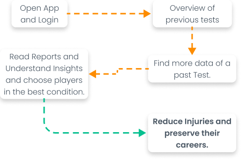
What the user flow top level idea behind the screens looked like.
Since the primary platform was iOS a design system keeping in mind Apple’s Human Interface Guidelines was designed.
* The Following is a representation and actual design system would be more elaborate with documentation.
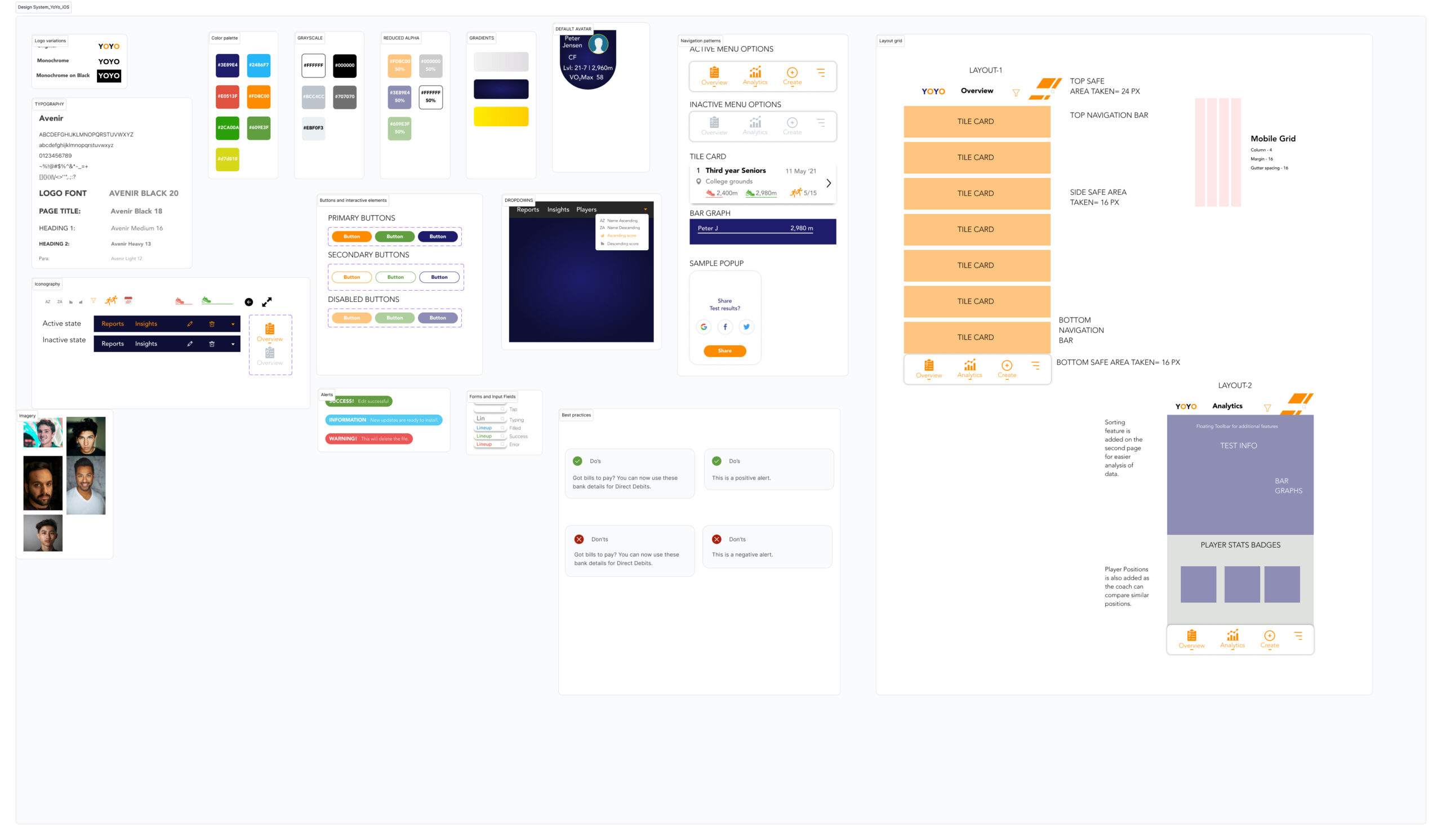
What problems and challenges I encountered and how I dealt with it.
● Be Software Agnostic: Mid way of the project, it was decided to migrate from XD to Figma as we needed a collaborative online tool. It was painful to migrate the design files, Fix broken components and Styles but it paid off later.
● Collaboration is a key: I worked with over 2 developers, 1 PM, and 1 QAs continuously for the project. Collaboration is a key to success for any projects.
● Focus on creating real Value for clients: While creating an online fitness trainer App for yoga would require a dedicated trainer and provide no real metric to measure fitness. This highlighted the need to go past trending themes and deep dive for creating real value.
Where do I see this product in 6 months or a year from Now.
● This idea could be expanded to cover more universities.
● Include various aspects of running like training for specific sports, Football, track and field events.
● Include ability to conduct individual trials. Build for individual Fitness enthusiasts. rather than just an enterprise solution.
To Explore how my design solutions can have a positive impact on your business.
Book a free 15-30 minute discovery call to see if we could be a good fit.
#ui #uxdesign #userexperience #ux #uidesign #wireframe #styleguide #mockups #highfidelity #adobexd #prototype #productdesign #interactiondesign #visualcommunication #userinterfacedesign #appdesign #fitness #YOYO #userinterface #usercentereddesign